
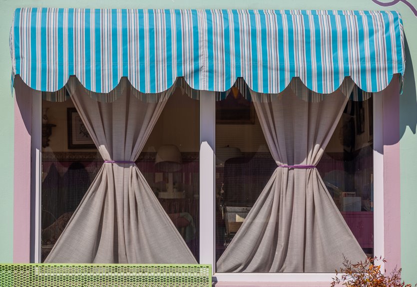
I’ve learned the hard way that the best curtain color depends entirely on your wall’s personality, not some Pinterest fantasy. White walls crave contrast; navy becomes instant art, silver-grey whispers modern elegance. Beige and greige? Earthy rust or olive green wrap you in warmth. Blue walls love neutral sand or silver-gray; green craves tone-on-tone calm. Warm terracotta walls absolutely need ivory or soft cream to avoid that pumpkin-spice catastrophe. I’ve been there. Dark walls demand velvet texture and layered lighting; otherwise you’re living in a cave. I always test real fabric swatches at 7 AM, noon, and under my actual lamps because that “perfect” warm beige can turn institutional gray faster than my mood on a Monday. The secret nobody tells you is this: match undertones to your floors and furniture, not just the wall paint chip. Texture tricks and room-specific rules will prevent costly decorating mistakes.
What Color Curtains Work With White Walls?
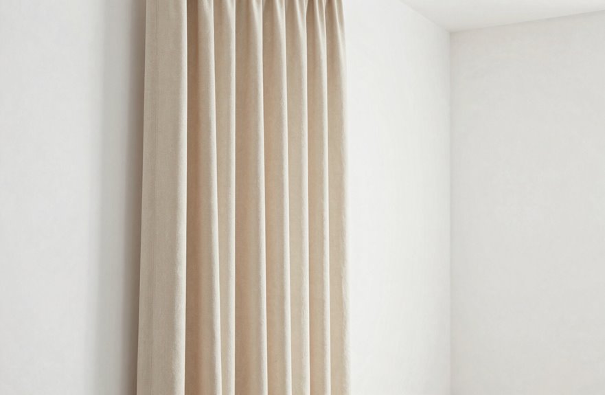
Why do white walls feel both like a blank canvas and a terrifying void all at once? I’ve stood there, paralyzed, holding fabric swatches like some kind of design hostage.
White or light grey curtains create a crisp, gallery-worthy look, similar to Kelly Wearstler’s Malibu projects. The Rule of Three works beautifully here; pale curtains become your 30% accent against those dominant white walls. Silver-grey adds modern contrast without demanding attention. Ivory provides warmth, transforming a living room into a personalized space.
For drama, navy or charcoal curtains create stunning contrast against white walls. Neutrality doesn’t mean boring. Charcoal velvet can transform sterile spaces into cozy sanctuaries. White walls work with a wide range of curtain colors.
Curtains for Beige, Cream, and Greige Walls
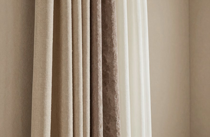
How do beige walls somehow feel like the safest choice and the trickiest to get right? I’ve been there, staring at my “perfect” greige living room, paralyzed by curtain options.
Here’s what actually works. Beige curtains in earthy tones, rust, dusty rose, olive green, create that warm, natural harmony we’re all craving. I learned this the hard way after three failed Target runs. Neutral linen options like flax and oyster add tactile depth without shouting for attention. Layered window treatments are your secret weapon: pair light inner panels with a textured outer layer, and suddenly your space feels designed, not decorated.
Warm neutrals with red or orange undertones work well, but balance them carefully. I once went too amber in my dining room and felt like I was eating inside a sunset. Restraint keeps beige’s calm, airy quality intact.
Best Curtain Colors for Blue and Green Walls
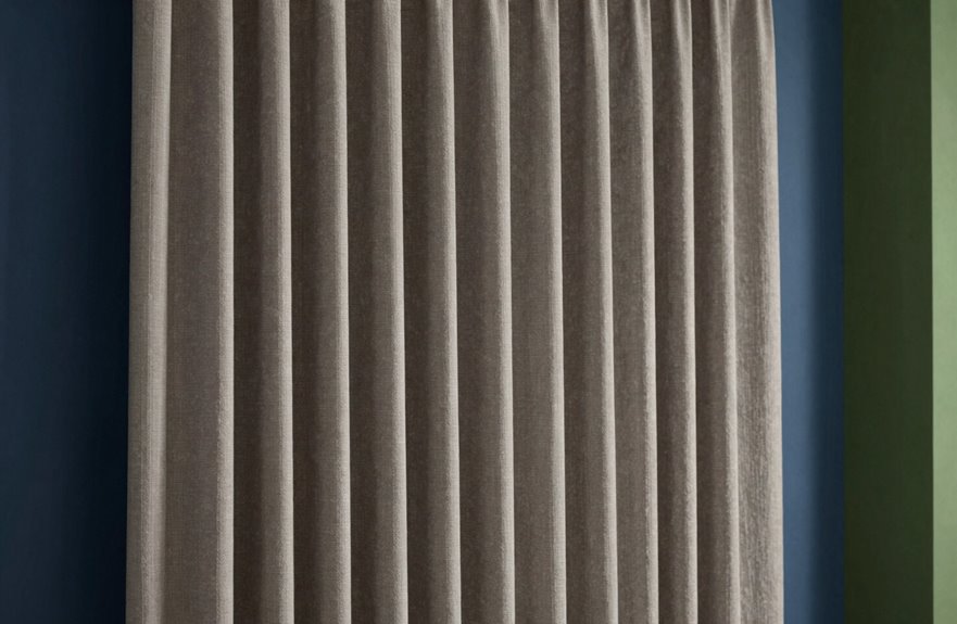
Neutral curtains, think beige, sand, even silver-gray, soften everything without stealing the show. Lighter blue walls pair well with neutrals, while navy curtains demand mustard accents. Avoid saturated blues with busy patterns, as they create visual conflict. Subtle textures and tone-on-tone calmness create the most cohesive look. Blue walls benefit from this restrained approach.
Curtains for Warm Walls: Yellow, Red, and Terracotta
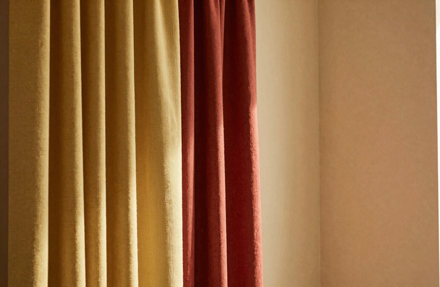
- White or ivory curtains neutralize intensity, giving your eyes a rest from the heat
- Golden or mustard drapery doubles down on earthy charm, as featured in Martha Stewart Living
- Deep brown or chocolate keeps things grounded, like a warm hug from your favorite leather chair
- Gray or charcoal offers cool sophistication, tempering warm walls with modern edge
Linen in soft cream or warm taupe works well for burnt orange spaces seeking that “come sit awhile” feeling. These combinations have been tested in various living room settings.
Dark Curtains on Dark Walls: How to Make It Work
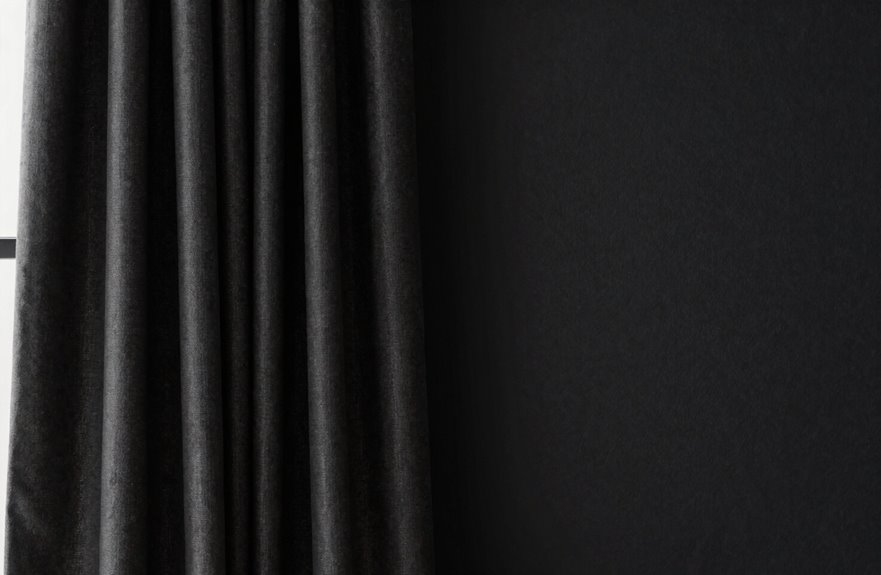
I’m obsessed with this moody combo, and I’ve learned the hard way that dark curtains on dark walls can go from “cozy sanctuary” to “cave of doom” real fast if you don’t nail the texture game. That’s why I always hunt for velvet (think the lush drapes Kelly Wearstler used in that Malibu project) or a subtle metallic weave that catches your sconces differently than matte charcoal paint. Without that light-play, you’re basically staring at a black hole. We’ll break down how to layer tones like a pro, use your fixtures strategically, and yes, I’ll admit my own disaster with navy-on-navy that looked stunning in the store and like a void by noon.
Contrast Through Texture
Dark walls can feel like a velvet-lined jewelry box: luxurious, but you need the right pieces inside to make it work. Texture saves dark-on-dark from falling flat.
For depth that welcomes you home:
- Layer velvet over matte linen. Your fingers catch what your eyes almost miss.
- Scale up to 1.5–2x fullness, floor-length, so the fabric breathes against the wall.
- Weave in lighter trims or patterned underlayers for contrast that adds visual interest.
- Let lighting graze the surface. Shadows become your advantage, not obstacles.
I once hung midnight-blue velvet in my charcoal bedroom and nearly panicked. Then I added a slubby silk band. Suddenly the room felt cohesive. Texture is functional; it creates visual depth and tactile interest.
Strategic Lighting Choices
You can layer all the velvet and linen in the world, but without the right light, your dark curtains will swallow the room whole. My first attempt at a moody bedroom looked like a cave, and not the chic, intentional kind. The secret isn’t flooding the space with brightness; it’s about sculpting light so your curtains become dimensional, not disappear.
I position adjustable sconces to graze the fabric’s texture, creating shadow play that reads as depth, not void. Warm bulbs, 2700K and never clinical, bounce off metallic threads in charcoal velvet panels, offering subtle contrast against near-black walls. I test everything across daylight hours; that sultry navy I loved at noon turned muddy by dusk. Lighting transforms your curtains from heavy mistake to intentional sanctuary.
Tonal Layering Techniques
The trick isn’t avoiding darkness; it’s weaponizing texture so your eye has somewhere to land. I learned this the hard way in my first apartment. Charcoal walls with flat black curtains looked like a cave, not a cocoon.
What actually works:
- Velvet with a subtle sheen catches light differently throughout the day, creating movement where solid color falls flat
- 1.5–2x curtain fullness gives you those luscious, pooling folds that read expensive, even when you’re not
- Undertone contrast, think blue-gray against warm charcoal, keeps things from going muddy
- Layering sheers behind allows lighting diffusion while maintaining that dramatic exterior moment
I always add lighter trim or lining, a designer trick I borrowed from a Nate Berkus spread. You control privacy, preserve the mood, and your dark-on-dark room becomes intentional rather than accidental.
The 60-30-10 Rule for Curtain Color Balance
How do we keep a room from looking like a chaotic explosion at a paint factory? The 60-30-10 rule provides a proven method for color balance.
Here’s how it breaks down:
| Element | Percentage | My Example |
|---|---|---|
| Walls | 60% | Soft sage green |
| Curtains | 30% | Deep forest velvet |
| Accessories | 10% | Brass candleholders, terracotta pots |
| Wall-curtain harmony | Critical! | Complementary, not competing |
| Result | Balanced bliss | Cohesive, not chaotic |
This method comes from studying EaseEase designs, which demonstrate excellent proportional balance. Bold curtains can absolutely dominate that 30% without overwhelming the space. Think of them as your room’s statement necklace. The key is coordinating curtain and wall colors for harmonious contrast, not clashing warfare. Once you apply this 60-30-10 rule, your room will reflect intentional design choices.
Complementary vs. Analogous: Choose Your Energy Level
Complementary versus analogous color schemes offer distinct approaches to controlling energy level in a room. Use a color wheel to guide your selections:
- Complementary schemes, like cobalt curtains against a tangerine accent wall, create electric contrast that produces visual intensity.
- Analogous pairings, such as sage curtains with moss and olive tones, establish a calm, restful environment.
- Higher contrast produces higher energy; lower contrast creates a softer, more unified aesthetic.
- Your curtains function as the room’s mood setter, so select them intentionally.
Test undertone colors in natural light before finalizing your choice. A room that feels jarring rather than peaceful indicates the colors need adjustment.
Fix Flat Monochrome With Texture Variation
Why settle for a monochrome room that falls flat when texture’s right there waiting to rescue you. I’ve learned through experience that curtains in the same color family as your walls can sing when the fabric does the heavy lifting.
| Texture Pairing | Visual Effect |
|---|---|
| Linen curtains + matte walls | Airy, relaxed depth |
| Velvet curtains + woven walls | Luxurious, cozy contrast |
| Bouclé fabric + smooth surfaces | Tactile, inviting interest |
| Satin curtains + nubby textiles | Sophisticated shimmer balance |
I once draped my entire bedroom in one beige, which felt uninspired. Then I swapped in wool curtains against linen upholstery, and suddenly my monochrome scheme felt intentional rather than lazy. The limited palette actually became richer and more layered. We’re not abandoning color restraint; we’re making it work smarter. Your fabric choices transform flat into visually dynamic spaces. Texture variation within a single color family creates depth that makes a monochrome room feel deliberately designed rather than incomplete.
Light or Dark Curtains? Room Size Decides
Where do you even begin when staring at fabric swatches that range from whisper-white to midnight black? I’ve been there, paralyzed in the curtain aisle, and curtain lightness isn’t just about mood. Room size calls the shots.
Let me break this down for you:
- In my tiny bedroom, pale linen curtains against soft gray walls created instant spaciousness through daylight reflection
- My friend Sarah’s sprawling loft? She went charcoal velvet (so jealous.) and it feels like a hug
- The Rule of Three saved my sanity. 60% walls, 30% curtains, 10% accents keeps things balanced
- Contrast with walls matters hugely; I’ve seen crisp white drapes disappear into white trim (rookie mistake.)
Poorly lit spaces need lighter curtains for openness, while sun-drenched rooms can handle dramatic darkness. Your room’s personality will guide your choice.
Warm vs. Cool Neutral Curtains
Once you’ve settled on light or dark, the real fun begins because neutrals aren’t as neutral as they seem. Warm neutrals (think ivory, beige, tan) wrap your living room in a gorgeous, lived-in energy. They work beautifully with wood floors and layered textures, creating a welcoming atmosphere.
Cool neutrals (cool whites, greys) offer a different aesthetic. They’re crisp and tailored, making them suitable for bedrooms designed for relaxation. Warm beige in a bedroom can feel too cozy for sleep, potentially interfering with rest.
Undertones matter significantly. Check your furniture and flooring for red, orange, yellow (warm) or blue, green, purple (cool) undertones. Matching these undertones across your space creates visual cohesion and prevents clashing between elements.
How Fabric Texture Changes Color Perception
Texture is where the magic happens. It’s the difference between a curtain that looks “fine” and one that makes you gasp when the afternoon light hits it. How a fabric absorbs or reflects light (think of that velvety Mohair you spotted in last month’s *Elle Decor* spread with the olive-green sitting room) completely transforms what your eye reads as the “real” color. The surface weave, whether it’s a nubby Belgian linen like Libeco’s famous Oatmeal or a tight silk dupioni, creates these micro-shadows that either flatten or electrify the hue. The same dusty blue can read as moody and cave-like in a heavy wool crepe (remember that Miles Redd library photo), yet turn breezy and sun-bleached in a loose, open-weave scrim. Same pigment, different character entirely.
Light Absorption Effects
Because I’ve spent many afternoons examining fabric swatches in my living room, texture absolutely affects color perception. Light absorption is the key factor here, and fabric texture determines how much light gets absorbed.
- Velvet (that plush, tactile material) absorbs light, making emerald panels appear more saturated and rich
- Sheer linen bounces light throughout the space, so “soft sage” reads as noticeably brighter
- Daylight color shift is measurable. The same sage fabric in a north-facing bedroom appears cooler and more gray by 3 PM
- Blackout curtains transform amber tones into darker, moodier versions; artificial light restores the original warmth
Understanding these light absorption effects allows you to make intentional fabric choices for your space.
Surface Weave Impact
Light absorption tells only half the story. Surface weave is what truly affects how your eye perceives color. Textured weaves like bouclé or tweed add depth, making fabric color read richer and more complex than flat weaves. Sheer fabrics create light diffusion that softens everything, producing a different effect from the same paint chip. Heavy velvets absorb light and turn moody, which works well for cozy spaces.
Subtle heathering or nubby textures cause undertone shift. That gray you selected might suddenly read blue against your walls. Understanding weave prevents confusion when selecting curtains. Weave structure fundamentally changes how a fabric appears, regardless of its base color.
Bedroom vs. Living Room: Different Curtain Rules
Step into any room, and you’ll immediately notice the curtains make or break the whole vibe. Bedrooms and living rooms require different approaches.
In bedrooms, choose colors that promote sleep: muted blues, soft grays, and deeper tones. Blackout lining provides light control and privacy. Living rooms should feel open, so neutral and warm tones work best, following the classic 60-30-10 rule.
What works based on experience:
- Light fabrics expand cramped bedrooms, while dark curtains add coziness to oversized spaces
- Bright rooms benefit from contrast with bolder drapes; dim spaces need lighter fabrics to reflect light
- Avoid matching walls exactly. Subtle contrast creates the depth you’re looking for
- Harmonize undertones with furniture and flooring for a cohesive look when you come home
Read Your Wall Color’s Hidden Undertone
I always start by squinting at my walls like I’m trying to read a blurry eye chart, the quickest way to spot whether that “neutral” paint is secretly blushing pink (warm) or throwing icy blue shade (cool). Warm undertones mean I’m reaching for curtains in earthy beige or that gorgeous rust I saw in a Domino magazine spread featuring Amber Lewis’s living room, while cool undertones have me hunting down grays and navy that won’t turn murky under my weird LED bulbs. I once hung cream curtains against a cool white wall and watched them look straight-up yellow by noon. Now I tape swatches up and observe them throughout the day to catch any color shifts before committing to a purchase.
Identify Warm Undertones
- Check against pure white. Warm undertones instantly reveal themselves.
- Test in natural light, not that deceiving overhead bulb that lies to everyone.
- Beige walls love company, especially wood tones and layered creams.
- Neutral curtains in ivory or tan become your cozy best friends.
Skip those icy grays that clash like a bad first date. Warm neutrals reflect sunlight beautifully, creating spaces where everyone wants to gather. Your living room will benefit from this approach.
Spot Cool Undertones
Cool undertones, those sneaky blue, green, or purple notes, completely change your curtain game. Test swatches in natural light, because that “neutral” paint is probably whispering frost.
For wall coordination that actually works, pair cool undertones with steel blue, charcoal, or crisp cool whites. These neutrals create that cohesive, calming vibe. Skip the ivory; it’s too warm, and suddenly your room feels like a bad blind date.
I once hung cream curtains against my cool grey walls, a rookie mistake. The clash was painful. Now I stick to undertone-aligned neutrals, and my space finally feels intentional and welcoming.
Test Swatches First: A 5-Step Checklist
Before committing to full panels, I spread swatches across my living room wall like I’m curating a tiny art exhibit. Lighting changes everything, and color shifts are inevitable.
Here’s my checklist for finding your perfect match:
- Test swatches morning, noon, and night. Natural and artificial light shift undertones dramatically. That “warm beige” looked institutional at 7 PM.
- Hold samples against your sofa and rug to catch clashing undertones before they become permanent fixtures in your space.
- Order true fabric cuts, not digital guesses. Sheen and texture change the game completely.
- Narrow to 2–3 finalists so you don’t spiral into decision paralysis.
Testing swatches in real conditions prevents costly color mistakes.