The ideas here run from a single bow or cloud sign to a full Colorful Sign Wall, a looping Neon Rope Pattern, and an RGB color-changing sign that cycles through shades.
A short name over the bed fits a standard headboard width, while a longer line like Better Late Than Ugly needs the wider wall above a sofa.
1. Custom Name Sign
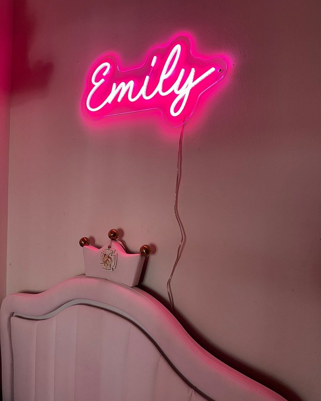
A name in script is the simplest way to make a room read as yours, and a pink one over a white headboard gives a soft, clean look.
Centering the sign above the bed keeps it balanced, and a short name like Emily reads easily from across the room.
Longer names take more wall, so measure the space above the headboard before you order.
2. Good Vibes Sign

Familiar phrases work well in neon because nobody has to decode them. "Good Vibes Only" in warm yellow-orange, with a small crown above and a heart below, feels playful without getting loud.
I like this one for a spot you see from the couch or bed, where the glow can do its job as a mood light.
Hang it at eye level or slightly higher, and leave empty wall around it so the icons don’t crowd the words.
3. Butterfly Neon Lights

Butterflies spread across a wall feel lighter than a single big sign, and three in a loose cluster gives the eye somewhere to travel.
Mounting them on a clear acrylic panel keeps the wiring tidy and lets the shapes appear to float.
Pink against a darker wall makes the glow pop most. I would stagger the sizes and angles rather than line them up straight; a little unevenness looks more like flight.
4. Custom Quote Sign

A quote you actually repeat to yourself earns its wall space better than a trendy one.
"No one is you and that is your power" is a good model: short enough to read at a glance, personal enough to mean something.
Keep the wording tight, since every extra word means more tubing and a bigger sign. Pink lettering with small butterfly or flower accents adds softness, but the words should stay the main event.
5. Game on Sign
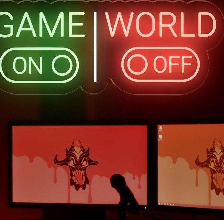
Gamers tend to sit in the same spot for hours, so a sign placed right above the monitors becomes part of the setup.
"Game On" in green and "World Off" in red splits the message into 2 colors, which makes it easy to read in a dim room.
Mount it centered over the screens so it frames the desk instead of competing with it. A sign this bright will reflect on glossy monitors, so check the angle before you drill.
6. Colorful Sign Wall

Mixing several different sign shapes on one wall works when you treat the wall as a collage instead of a tidy row.
Posters, records or small objects in the gaps between the lit pieces make the glow feel like part of a bigger scene.
Above a bed, this is the maximalist choice, and I would pick it only if you like busy. To keep it from turning chaotic, repeat 1 or 2 colors across the signs and give the rest free rein.
7. Comfort Zone Quote

A warning-style line works best when it sounds like a boundary, and this blue one does. Cool blue gives blunt words a calm edge instead of an angry one.
Long phrases need a lot of tubing, so pick wall space with room on both sides. I would keep the wall around it plain so the message gets read in full.
8. Neon Rope Pattern
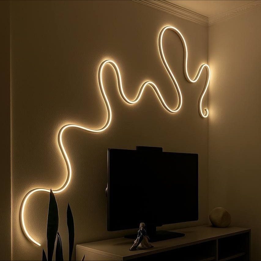
Flexible neon rope bends into any curve, which makes a wave a better fit than lettering for people who don’t want words on the wall.
Warm white is the gentlest color for it, giving you a soft line of light instead of a hard glare.
Sketch the path on the wall with painter’s tape first, then adjust until the curve feels relaxed. Wide, slow waves look calmer than tight zigzags.
9. Bow Neon Sign

A bow is about as simple as a neon shape gets, and that is its appeal. White keeps it clean, and it suits a small table or vanity where a full word sign would feel like too much.
Hang it centered over the surface below so the two read as one vignette. I would choose a small size here; a bow that outgrows the shelf under it loses the cute factor.
10. Cloud Neon Sign

Clouds soften a room without saying anything, which is why I like them for spaces where a quote would feel like too much. A warm white glow on a dark, neutral wall gives the shape plenty of contrast.
Because the outline is simple, the sign works well alone. Leave empty wall around it so the curves stay readable, and skip busy art nearby.
11. Sun Neon Sign

Rays are what make a sun sign work, since they spread light outward and give the wall a focal point. Yellow suits it best; any other color and the shape stops reading as a sun.
Over a sofa, I would center it on the seating so it acts like a piece of art. A dark wall makes the yellow glow stand out, and plain pillows below keep the eye on the sign.
12. Better Late Than Ugly

A joke sign only works if the room is playful too, and a pink script phrase like this one pairs well with bold textures such as leopard print and velvet.
The humor is the point, so keep the wording short and legible.
Place it where you see it while getting ready, near a mirror or a lounge spot. Script letters need clean spacing, so check proofs before ordering.
13. Perfectly Imperfect

Two lettering styles in one sign give the words a built-in tension. The word "perfectly" is set in soft pink script while the second word gets heavy block capitals, so the lettering itself carries the joke.
A charcoal, textured wall like this one gives pink tubing something to push against, so the color keeps its glow. Check the proof before ordering, since the script needs enough room beside the capitals to stay legible.
14. This Must Be the Place

"This Must Be the Place" works as a greeting, which suits a living room wall better than a bedroom. Pink lettering over green foliage is a bold pairing, and the sign holds its own against all that texture.
Hung in the middle of the wall above the sofa, it takes the place of framed art. I would keep the cushions and throws simple below, so the phrase stays the first thing guests see.
15. Mountain Neon Sign

A mountain range with a sun behind it gives you a view without any words.
The jagged line and round sun make a shape that reads fast, even from across the room, and it suits people who want a glow but not a message.
Warm orange-yellow looks right against a deep green wall. I would hang it over a plant or a chair, where it adds to a calm corner and doesn’t fight for attention.
16. Gaming Controller Sign
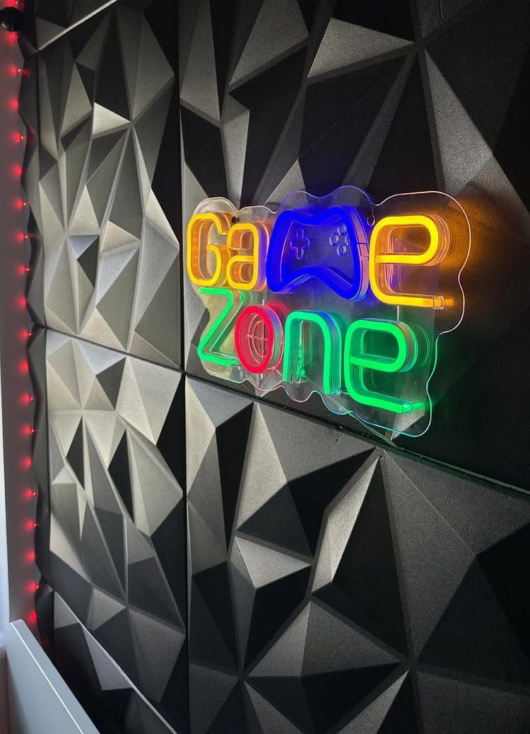
A controller icon plus a short phrase such as "Game Zone" tells everyone what the room is for. Mixing colors, with a blue controller beside the lettering, keeps it lively against a black wall.
Swap the text for your gamer tag or a nickname to make it yours. I would keep the wording to 2 short words, because every extra letter adds tubing and cost.
17. Gaming Quote Sign

A joke warning is the best use of a gaming sign for anyone who wants personality over polish. "Do Not Disturb, Gaming Mode Activated" tells visitors where they stand, and the controller icon makes the point at a glance.
Several colors on one sign help the lines separate, which matters with this many words. Dark brick gives the glow a rough backdrop, and I would leave the wall around it empty so the message reads cleanly.
18. Basketball Neon Light

Basketball fans can skip the poster and hang a lit hoop and backboard instead. White neon outlines the shape cleanly, and against a pink wall it feels fresh rather than locker-room.
Set it at a height where a real ball can sit or hang nearby, like the one in front of it. It works as a focal point in a game room, with sports gear as the only other decoration needed.
19. Game Symbol Lettering

Controller symbols standing in for letters turn a plain word into a gaming sign, and "GAME" is short enough to carry them. White tubing keeps the lettering readable, so the colored icons can stay small accents.
Mounted above the monitor, it frames the desk. Ask the shop for a digital mockup first, because game symbols like a D-pad or a controller outline blur into each other when the tubing sits too close.
20. Custom Artwork Sign
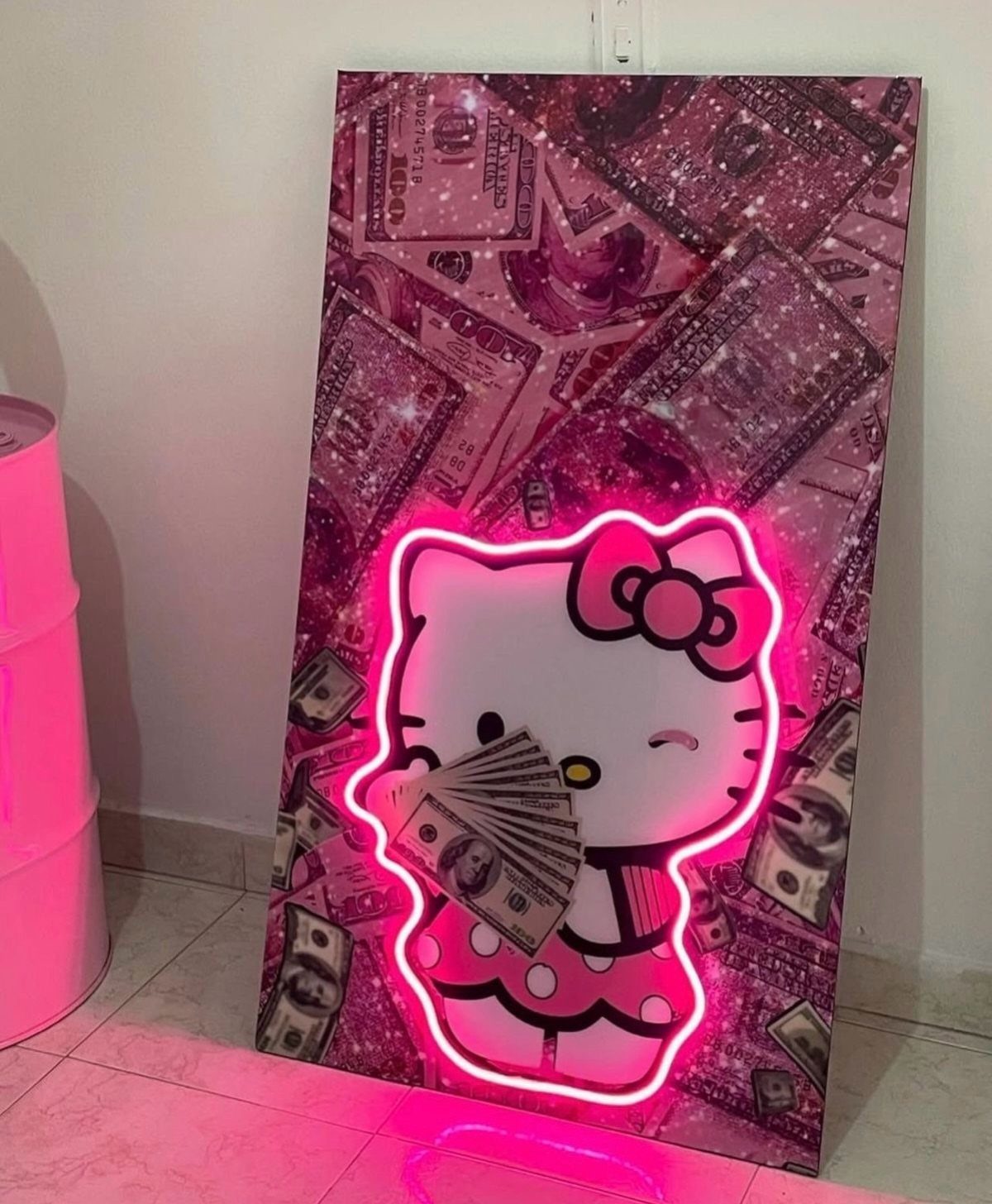
Neon doesn’t have to mean text. A character or illustration you already love can be traced into a sign, and an outline in pink suits a cute, graphic piece like a money-holding cartoon cat.
Pick artwork with bold, simple lines, since fine detail gets lost in tubing. I would lean the finished piece on a dresser or shelf rather than drilling into the wall, which makes it easy to move when you rearrange.
21. RGB Color-changing Sign

A sign with a color-changing RGB border lets one piece suit several moods: soft pink for daytime, cooler tones for evening. That flexibility makes it a smart pick if you can’t settle on one color.
Built into a mirror, as in a shaped vanity piece, it does 2 jobs and saves wall space.
I would choose RGB over a fixed color only if you will actually switch it; otherwise a single color you love looks cleaner.
22. Name Nightlight
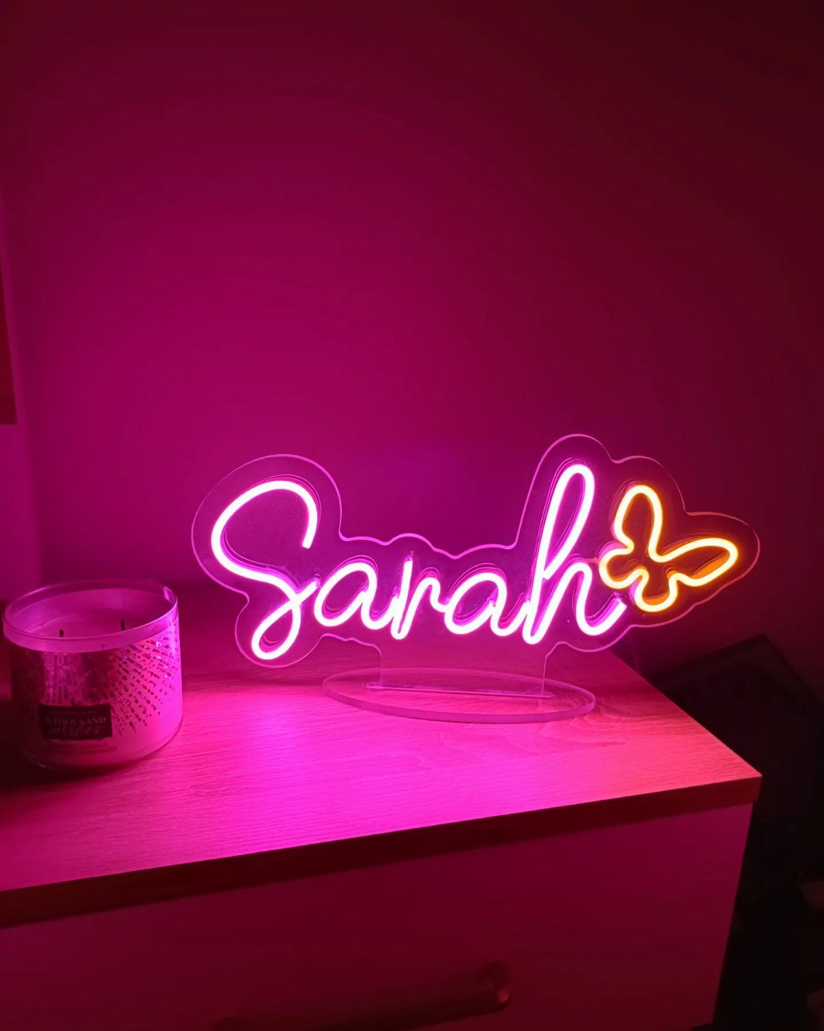
A child’s name in soft light works as decor and a nightlight at once, which is why I like it better than a plug-in lamp. Pink script with a small butterfly accent keeps it sweet without feeling babyish.
Set it on a dresser or bedside table, away from the edge, with the cord tucked behind the furniture. Keep the name short for a compact size that fits a small surface.
23. Personalized Sign Above Bed

Above the bed is the spot where a name does the most work, since the headboard wall is the one everyone looks at first.
Blue lettering reads cooler and calmer than pink, and "Oliver" is short enough to sit neatly over a standard headboard.
Center it on the bed, and measure the width before ordering. Keep the wall plain around it so the name stays the focal point.
24. Pink Quote Above Bed

A phrase in bright pink above the bed gives the room a personality it can’t get from pillows alone. "Do It for the Plot" is playful and short, and the lettering is clean enough to read from the doorway.
Center it above the pillows and leave a little wall between the sign and the headboard. Since it is a long phrase, measure the wall width first so the sign doesn’t crowd a shelf beside it.
25. Minimal White Word Sign

White script is the quietest way to do neon, and a short phrase like "With God" fits that mood. It adds a soft light to a neutral bedroom without bringing in a color.
It can rest on a shelf or nightstand instead of hanging, which suits a dark corner.
I would keep the phrase to 2 or 3 words so the cursive stays open and easy to read. Check the proof before ordering, since tight script loops can blur together.
26. Dripping Heart Sign

Drips turn a plain heart into something with attitude. The pink outline gives the bedroom wall a playful focal point, and the falling lines add height.
Pink blankets and roses repeat the color, so the sign feels part of the room.
Above the nightstand works best, with the wall around the sign left bare, because the drips need empty space to read. Ask the shop how long the drips run so you can measure the wall before you order.
27. Heart Sign in Bedroom

Sheer curtains soften neon into a diffuse glow, which suits a bedroom with pink and blue lighting. A heart is a good shape for it, since the outline stays readable even through fabric.
Choose pink or blue for the sign so it matches one of the room’s tones.
A small heart is enough here; the curtain does the work. A busy print behind it would fight the light, so a plain sheer is the better choice.
28. Neon Sign with Plants

Against a dark wall, a bright pink text sign gets all the contrast it needs, and trailing plants add a softer layer beside it.
A long line of text needs room to read, so the greenery should sit to one side instead of crossing the letters.
Let the vines hang below or beside the letters, never across them.
Small white flowers lighten the green and echo the glow. I would leave the area directly around the tubing clear, since covered letters lose the message.
29. Neon Sign with Wreath

A wreath makes a neon greeting look like a framed piece of decor. "Hello Gorgeous" in cursive with a small heart sits well inside a circle of roses and greenery, and the purple wall ties the colors together.
Make the wreath noticeably larger than the sign so the flowers stay clear of the tubing.
I would pick pink and purple blooms to match the glow. Mount the sign first, then build the wreath around it.
30. Neon Above a Sofa

In pink neon, "Always late but worth the wait" fills a wide wall, so it suits the space above a sofa better than a narrow one. The black glittery wall gives the light something to bounce against.
Measure the sofa first, then pick a sign narrower than its back so the two read together.
Pink and purple pillows pick up the glow without adding more decoration. I would leave the rest of the wall bare.
31. Neon in a Pink Bedroom
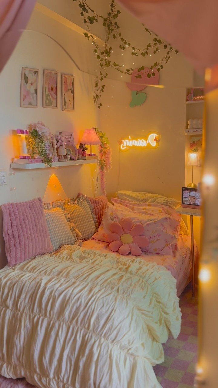
Warm yellow-orange is the one contrasting note in a room full of pink, and a small sign is enough to carry it.
Hung among the floral art and shelf decor, it reads as part of the collection instead of a loud statement.
I would line it up with the height of the other wall pieces, with the hanging vines and the shelf keeping the rest of the wall busy. A sign this size doesn’t need a wall to itself.
32. Pineapple Neon Sign

A pineapple needs no caption, which makes it a friendlier choice than words for a child’s room. Yellow and green tubing stands out against pink curtains and white walls without clashing.
With 2 beds in the room, I would hang it where both kids can see it, so it feels shared. Keep the wall around it clear so the shape can do the talking.
33. Astronaut Rocket Light

An astronaut riding a rocket is a picture sign, and multicolor tubing gives it a toy-like charm that words can’t. For a kid who loves space, I would pick this over a name sign.
Small enough to hold in 2 hands, it sits as well on a shelf or desk as it does on a wall. Standing it up means no drilling, which suits a rental.
34. Neon Sign on a Gallery Wall
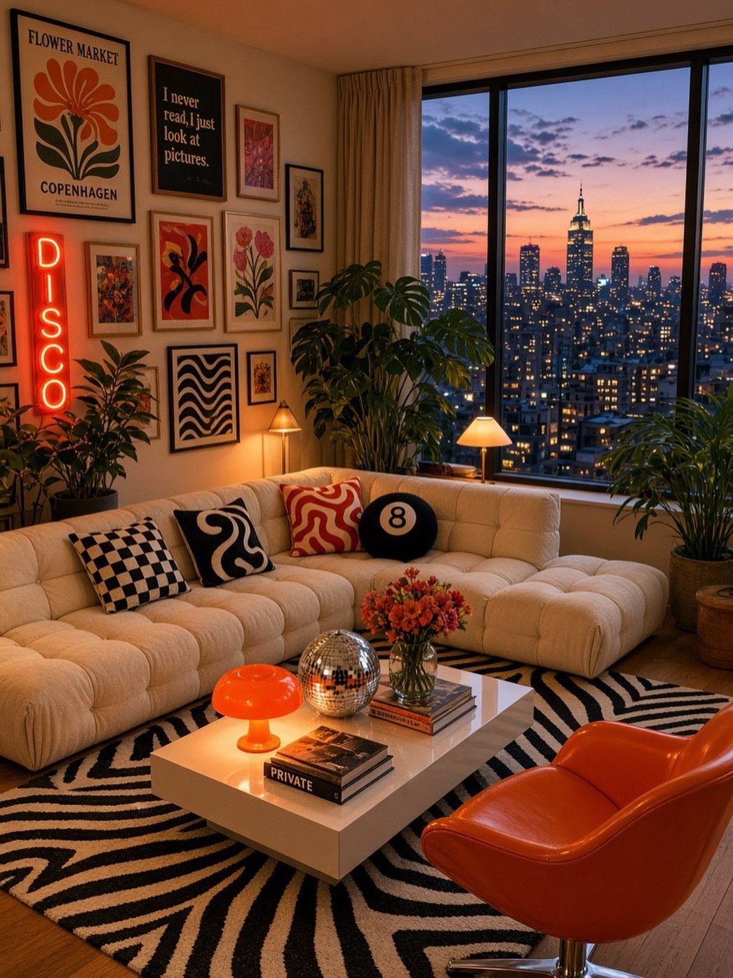
One red word among framed prints works like another frame, only louder. "DISCO" gives an eclectic wall a point of energy, and the red sits comfortably next to the warm orange chair.
I would hang it at the same height as the art and leave gaps between it and the neighboring frames, so the glow has room. Keep the other prints varied, since the sign already supplies the punch.
35. Neon Sign with a Coffee Table

Yellow lettering with a small pink heart keeps a message like "you are so loved" gentle, which suits a living room better than a loud slogan.
Keep the coffee table in front free of tall objects so nothing blocks the view of the wall. I would center the sign over the sofa and leave the shelving to the side.
Frequently Asked Questions
Where do LED neon signs work best in the home?
The wall behind the headboard wins for me, since it’s the first thing anyone sees on walking in. Above a sofa, size the sign a little narrower than the back cushions so the two read as one group.
A gaming desk works too, with the sign centered above the monitors, and small pieces like a bow sit well on a vanity or shelf.
Is LED neon safe for bedrooms and kids’ rooms?
LED neon signs are sold for kids’ rooms and nurseries, and sellers describe them as safe and energy-efficient. Check the product details for the exact sign you buy.
Will an LED neon sign be too bright for a bedroom or living room?
Not if you choose the color and setup with care. For a bedroom I’d go with warm white: it gives a soft glow instead of a hard glare, while cool blue feels quiet and calm.
Some signs are dimmable, and a sheer curtain in front of a sign spreads the glow softly. On a gaming desk, check the angle first, since a bright sign can reflect on glossy monitors.
How do I hang my neon sign, and is it renter friendly?
Hang it at eye level or a little higher, with empty wall around it so the shapes don’t crowd each other.
In a rental, skip the drill: a small sign can lean on a dresser, shelf or nightstand, and some pieces stand up on their own.
If the sign will sit near a screen, check the angle for reflections before you drill.
How do I choose a neon sign design that won’t feel dated?
A phrase you already say out loud beats a trending one, because a personal line holds its place on the wall long after the trend fades.
Short wording reads at a glance, and fewer letters mean less tubing and a smaller sign. If you would rather skip words, a simple shape like a cloud adds a soft glow without saying anything.
Does an LED neon sign use a lot of electricity?
LED neon is sold as energy-efficient, and some signs run on USB power. Wattage varies from sign to sign, so read the listing for the exact one you’re buying.
Does an LED neon sign make a good gift?
Yes, personalized signs are popular for birthdays and teen gifts, and a name or a gamer tag makes one feel personal. Look over the proof before you order; script lettering needs room between letters to stay readable.